Click on the gear settings to open the settings of the form.
Click on style settings and then click on Form settings to open the style settings of the Form.
Form settings are further divided into three parts - Input, Label, and Button.
Input
From input settings, you will be able to change the Input Fields Settings and Placeholder settings.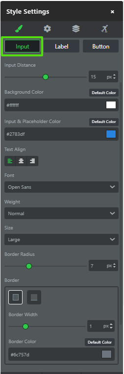
Input Distance - You can change the Distance between the Input fields in the form using this setting.
Background Color - You can change the background color of the Input field using this setting.
Input & Placeholder Color - You can change the Placeholder color used inside the input field using this setting.
Text Align - You can align the Placeholder text inside input fields using this setting.
Font - You can change the font of the placeholder text using this setting.
Weight - You can change the font weight of the Placeholder text to normal, bold, ultrabold, etc using this setting.
Size - You can change the size of the input field using this setting.
Border Radius - You can change the border radius of the input fields using this setting.
Border Width - You can change the border width of the border used in input fields using this setting.
Border Color - You can change the border color of the border used in input fields using this setting.
Label
From Label settings, you will be able to change the Label Settings of a Form.

Label color - You can change the Label color using this setting.
Text Alignment - You can align the Label text above input fields using this setting.
Font Family - You can change the font of the label using this setting.
Font Weight - You can change the font weight of the label to normal, bold, ultrabold, etc using this setting.
Font Style - You can change the font style to italic and normal of the label using this setting.
Font Size - You can change the size of the label font using this setting.
Letter Spacing - You can change the spacing between the label letters using this setting.
Capitalization - You can Select the Capitalization format of the label from the options like uppercase, lowercase, and Capitalize.
Button
From Button settings, you will be able to change all the required button style settings.
The button settings is further divided into three settings.
Button Text 
Button Themes -
After Clicking one can select from 20+ premade themes.

Button Text - Button Text is the Primary text in the button and Subtext is shown below the Primary text in the button.
Font family - Change the font family of the selected text element.
Font weight - change the font weight. for example - bold, normal, and Light.
Font Style - You can change the font style to italic and normal of the button text using this setting.
Text size - Change the size of the button text.

Height - Change the Height of the button using this setting.
Text align- change the text alignment to left, right, and center.
Text Color - change the color of the Button text element.
Capitalization - You can Select the Capitalization format of the button text from the options like uppercase, lowercase, and Capitalize.
Button Color - You can change the background color of the button using this setting.

Button Width - You can increase or decrease the width of the button in form using this setting.
Top Margin - You can add a top margin to the button using this setting.
Button Alignment - You can align the button on the left, center, and right using this setting.
Sub Text

Sub Text - Subtext is shown below the Primary text in the button.
Font family - Change the font family of the selected text element.
Font weight - change the font weight. for example - bold, normal, and Light.
Font Style - You can change the font style to italic and normal of the subtext using this setting.
Text size - Change the text size of the subtext.

Text align- change the text alignment to left, right, and center.
Text Color - change the color of the subtext.
Capitalization - You can Select the Capitalization format of the subtext from the options like uppercase, lowercase, and Capitalize.
Icon

One can add an icon in the button in the front of the button or back of the button using this setting.
At front - An icon will be added to the front of the button.
At back - An icon will be added to the back of the button.
Icon Size - Changes the size of the icon used in the button element.
Margin - Changes the size between the icon and the text.
Icon Color - Changes the Color of the icon used in the button element.
Choose From different icons by Clicking on the “ADD” button.

This screen will appear once you click on the "ADD" button.
Was this article helpful?
That’s Great!
Thank you for your feedback
Sorry! We couldn't be helpful
Thank you for your feedback
Feedback sent
We appreciate your effort and will try to fix the article