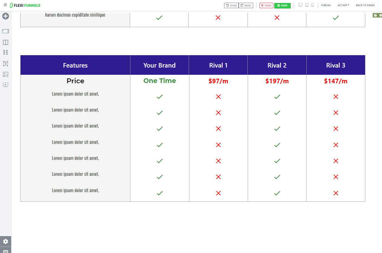
THE END GOAL IS THIS
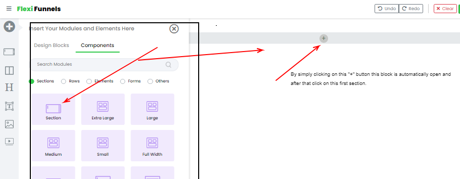
Step 1 - Right now you are on the editor screen. As you can see below the screenshot.
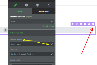
After that when you click on the section. Now it looks like this. (below screenshot)
Step 2 - Change the setting of the section from EXTRA LARGE to FULL WIDTH.
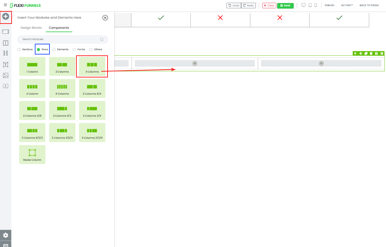
Step 3 - Add a “3-columns” row into that section. By simply clicking on the “+” as you can see in the previous screenshot.
Step 4 - Let’s first change the row margin(From the left and right).
Step 5 - Now let’s add a headline element. Simply clicking on the “+” button.

Step 6 - Change the text by double-clicking on it and the text setting(font-size, font-weight, color, etc)
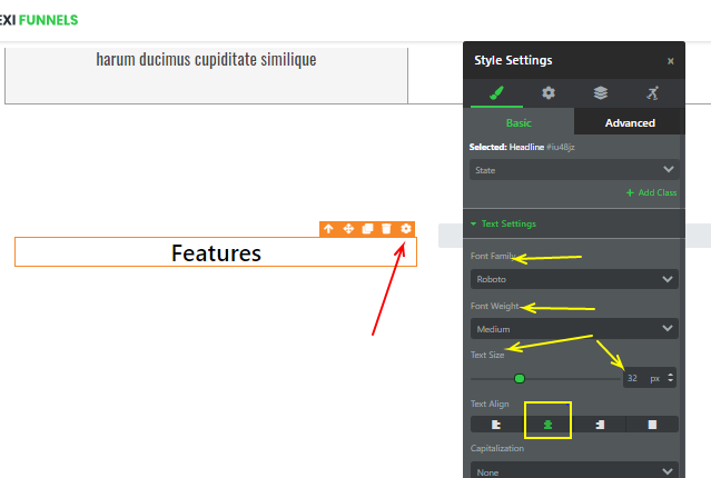
After changing the setting of the element. Now click on the column and change the Background color.

After that change the text color so that it would be visible on this background.

Step 7 - After making the 1st column make 4 clones and change the text of those clones and delete the last two vacant columns .
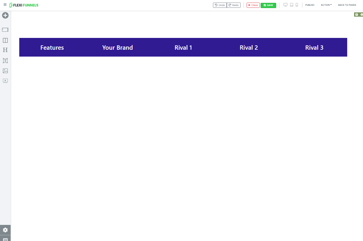
Step 8 - Now change the text of the columns by simply double-clicking on it. (See the previous screenshots)
After changing the text. It will look like this.
Step 9 - Now let’s take the 1st column and give the border from the right-hand side.

Similarly, do the same thing with the last column(RIVAL 3)

Step 10 - Let’s do some changes in the 2nd and the 4th column. Give a border from the left and right sides. Changes have to be made which we marked as the YELLOW BOX.
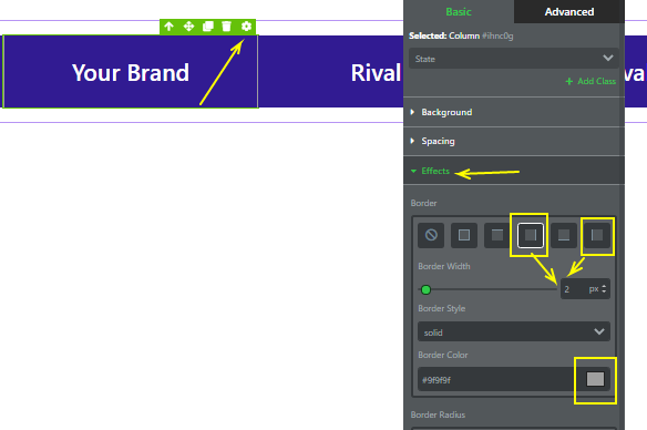
Similarly, do the changes in the 4th column.
And after changes, it will look like this.
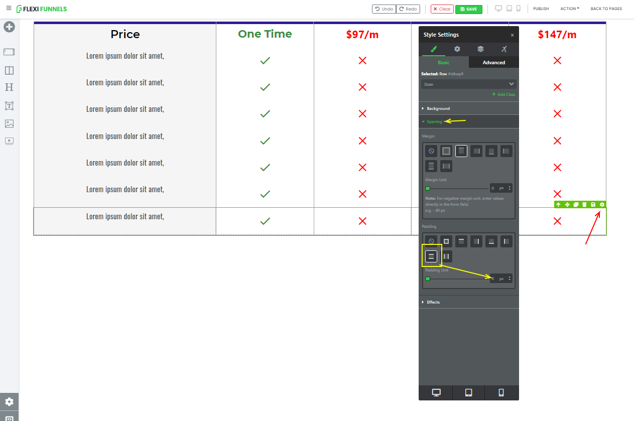
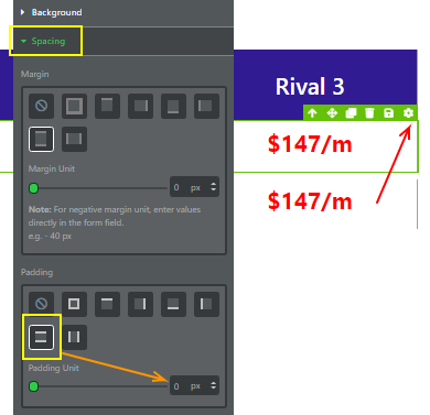
Step 11 - Now Simply make it a clone of the entire row and give padding(0px) to the 1st row ONLY.
In the below screenshot we changed the padding of the ENTIRE ROW now the last column.

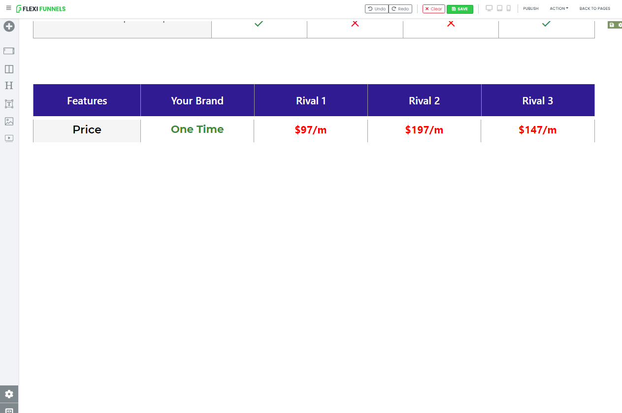
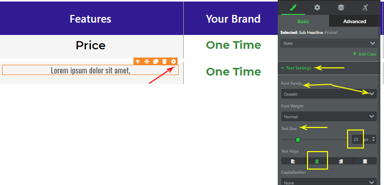
Step 12 - Let’s again follow the same procedure, change the text and the text settings(color, weight, font, size, etc) of the 2nd row. (Please look at the previous screenshot)
After changes, it will look like this.
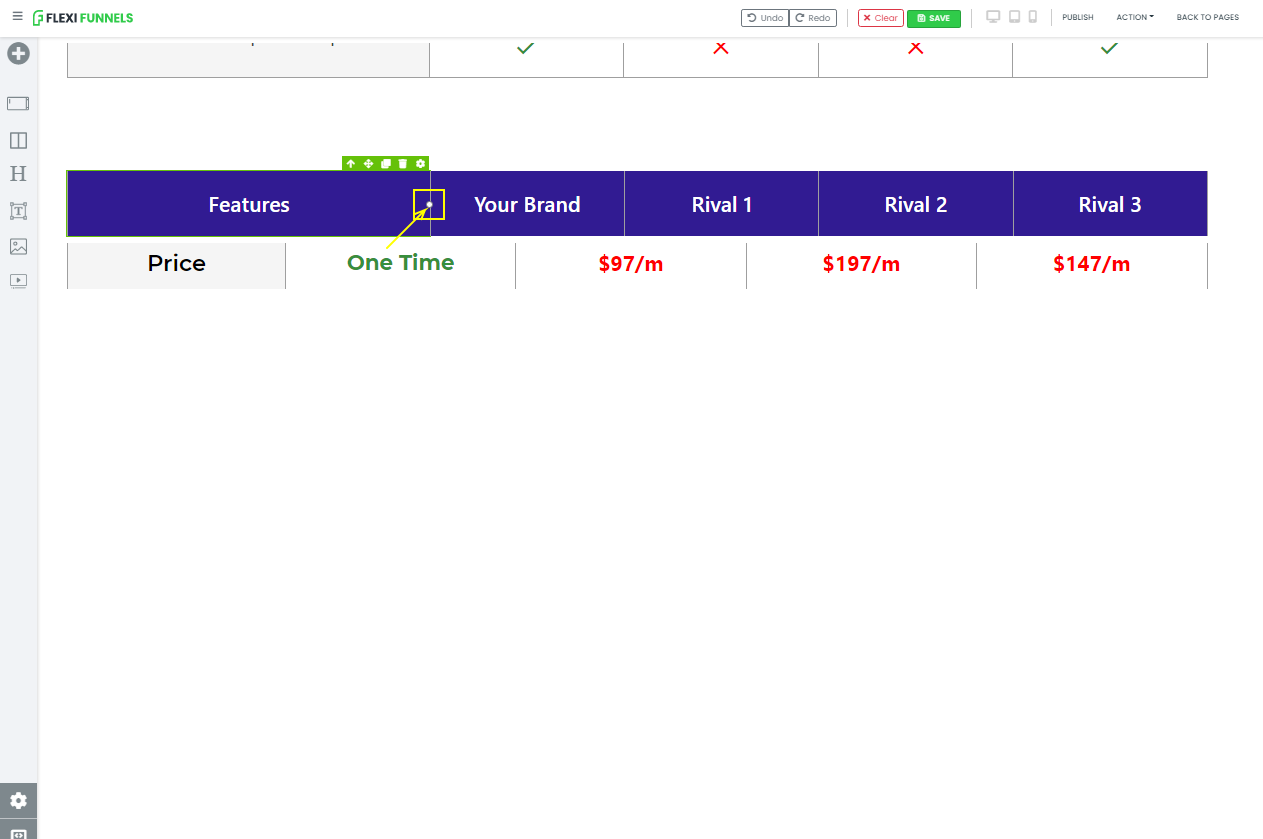
Step 13 - Now before making more clones let’s set a little bit so that it will look more good. Take the 1st row and drag it from the right-hand side by using this white dot.
Similarly, do with the 2nd row.
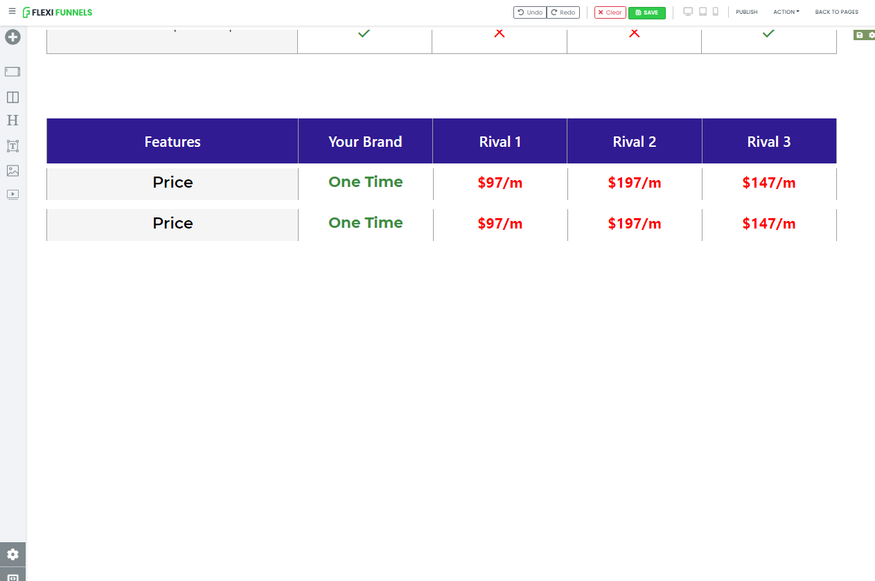
After adjusting a 2nd row make it a clone and give padding (0px) to the 2nd row.
We repeat the same process again and again.
1.Make it a clone of that row and after that,
2.Give padding (0px) to that row.
1.
2.
Step 14 - Now follow the same process and change the text and the text settings of the 1st column of the 3rd row.
Step 15 - Delete the text of the 2nd, 3rd, 4th, & 5th columns and add an icon in those columns.

Step 16 - After deleting simply add an icon,
Change the icon image from person to Close/Check or you can choose anything.
By double-clicking on the person’s icon. The icons box will appear.
And you will find the search bar where you can search the icon(Close, Check, or anything.)
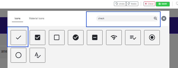
Step 17 - Simply click on it and it will appear. After that change the icon color and size.
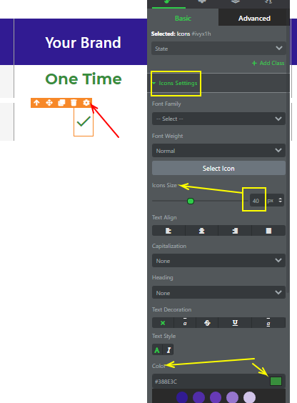
Step 18 - Follow the same steps and add the close icon in the 3rd column.

Step 19 - After adding the icon change the color of the icon.

Step 20 - Similarly add icons in the remaining columns.
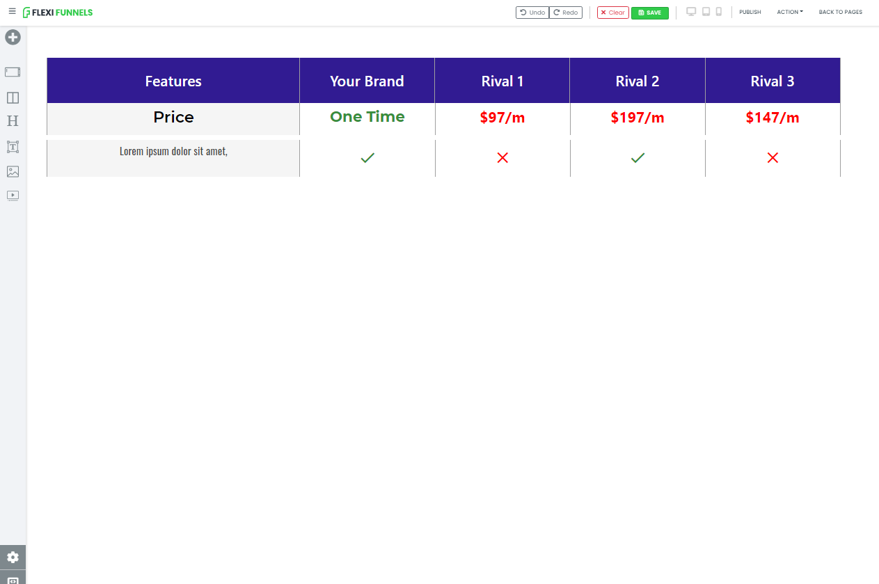
And after adding it. It will look like this.
Step 21 - We repeat the same process again and again.
1.Make it a clone of that row and after that,
2.Give padding (0px) to that row.
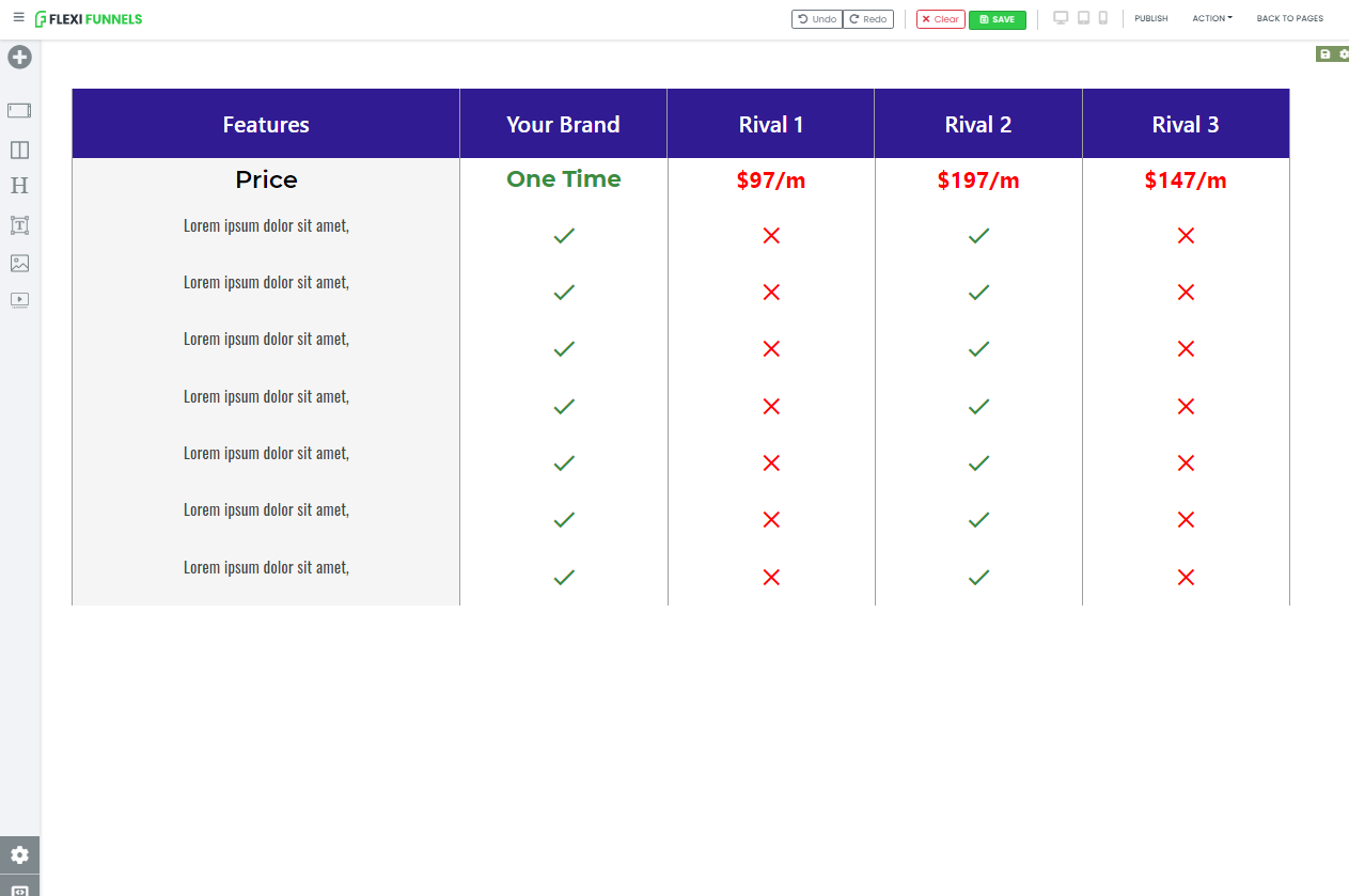
After doing these two steps your section will look like this.
You can change the text and icons at your convenience.
Step 22 - Give the border of the last row only from the downside. After that, you have to give padding (0px).
After doing all the changes now your section is ready. Here is the look.
Congrats!!! YOU achieved your final goal.
NOW, DO PRACTISE TO HONE YOUR SKILL.
Was this article helpful?
That’s Great!
Thank you for your feedback
Sorry! We couldn't be helpful
Thank you for your feedback
Feedback sent
We appreciate your effort and will try to fix the article

