What This Feature Does
Brand Settings control the visual identity of your membership area — logo, background, banner, and theme colors. This is what makes your membership look like your brand instead of a generic template.
Before You Start
- Have your logo file ready (recommended: transparent PNG background)
- Have your brand colors ready as hex codes (e.g.,
#012329) — pull these from your brand guide if you have one - If using a background image, have it ready in a reasonably high resolution (low-res images will look blurry/stretched)
Step 1: Open Brand Settings
- Log in to your FlexiFunnels dashboard
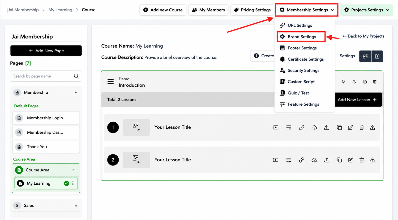
- Navigate to Membership Settings
- Click "Brand Settings"
Step 2: Upload Your Logo
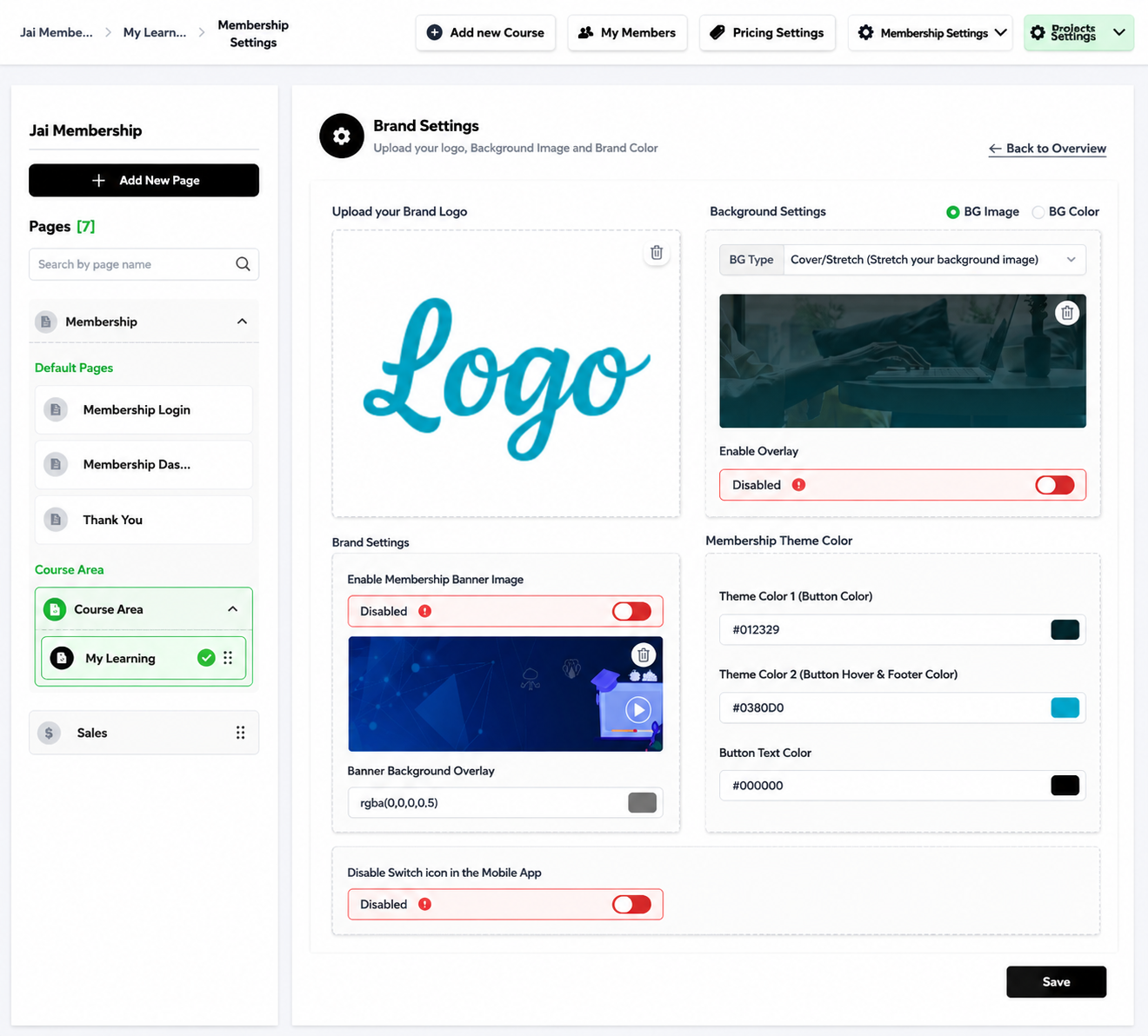
- Find the Logo Upload section
- Upload your logo image
- This will appear in the header of your membership area, visible on every page
Tip: Use a transparent PNG rather than JPG — this avoids an ugly white/colored box around your logo if your header background isn't white.
Step 3: Configure the Background
- BG Type:Choose how your background image displays
- Cover — fills the entire space, may crop edges of the image
- Stretch — fills the space but may distort the image if its proportions don't match
- Upload Background Image: Add the image you want behind your header
- Enable Overlay:Toggle ON if your background image makes text hard to read
- This adds a semi-transparent dark layer so your header text/logo stays visible on top
Tip: If your background image is busy or brightly colored, always enable the overlay — otherwise your logo and menu text may become unreadable.
Step 4: Configure the Banner
- Enable Membership Banner Image: Toggle ON to show a banner image below your logo (separate from the background)
- Banner Background Overlay (RGBA):Adjust the overlay color and transparency on the banner
- Format:
rgba(red, green, blue, opacity) - Example:
rgba(0,0,0,0.5)= black overlay at 50% transparency (a common, safe default for text readability) - Lower the last number (e.g.,
0.2) for a lighter, more subtle overlay - Raise it (e.g.,
0.7) for a darker, more dramatic overlay
- Format:
- Disable Switch Icon in Mobile App: Toggle this if you don't want students switching between tabs in the mobile view (e.g., if you only have one tab/section and the icon is unnecessary clutter)
Step 5: Set Your Theme Colors
| Setting | What It Controls | Example |
|---|---|---|
| Theme Color 1 | Primary button color throughout the membership area | #012329 (dark teal) |
| Theme Color 2 | Button hover color + footer bar color | #03B0D0 (bright blue) |
| Button Text Color | Text color inside buttons | #000000 (black) |
Tip: Make sure your Button Text Color has strong contrast against Theme Color 1. For example, black text (#000000) on a dark background color will be unreadable — use white (#FFFFFF) instead if your primary color is dark.
Step 6: Save
- Click "Save" at the bottom-right
- Refresh your membership area (or open in incognito) to confirm all changes appear correctly
Real-World Scenario
Goal: Brand a fitness membership with a dark, premium look.
| Setting | Value |
|---|---|
| Logo | Transparent PNG, white logo |
| Background Image | Gym photo |
| Enable Overlay | ON (background photo is busy) |
| Banner Overlay | rgba(0,0,0,0.6) — dark overlay for a moody, premium feel |
| Theme Color 1 (buttons) | #1A1A1A (near-black) |
| Theme Color 2 (hover/footer) | #FF4500 (orange-red, energetic accent) |
| Button Text Color | #FFFFFF (white, for contrast against the dark button) |
Result: A cohesive dark theme with an energetic accent color, with logo and text remaining readable over the background photo thanks to the overlay.
Common Issues & Fixes
| Problem | Likely Cause | Fix |
|---|---|---|
| Logo looks blurry or pixelated | Uploaded image resolution too low | Re-upload a higher-resolution logo (ideally 2x the display size) |
| Logo has an ugly white box around it | Logo file is JPG (no transparency) instead of PNG | Re-export your logo as a transparent PNG |
| Text is unreadable over the background | Overlay is disabled, or background image is too bright/busy | Enable the overlay, or increase overlay opacity |
| Button text is invisible | Button Text Color too close to Theme Color 1 (low contrast) | Choose a contrasting color (e.g., white text on dark buttons) |
| Changes don't appear after saving | Save wasn't clicked, or browser is showing a cached version | Re-click Save; hard refresh the page (Ctrl+Shift+R) or check in incognito |
| Banner overlay color looks wrong | Incorrect RGBA format | Double-check format is rgba(r,g,b,opacity) — opacity must be between 0 and 1 |
Was this article helpful?
That’s Great!
Thank you for your feedback
Sorry! We couldn't be helpful
Thank you for your feedback
Feedback sent
We appreciate your effort and will try to fix the article