Overview
FlexiFunnels lets you control whether a website section is displayed on all devices, desktop devices only, or mobile devices only. Use section visibility settings to create device-specific layouts and provide a better browsing experience for visitors.
Before You Begin
- Open the required website page in the FlexiFunnels editor.
- Identify the section whose device visibility you want to change.
- Decide whether the section should appear on all devices, desktop only, or mobile only.
Step 1: Open Section Settings
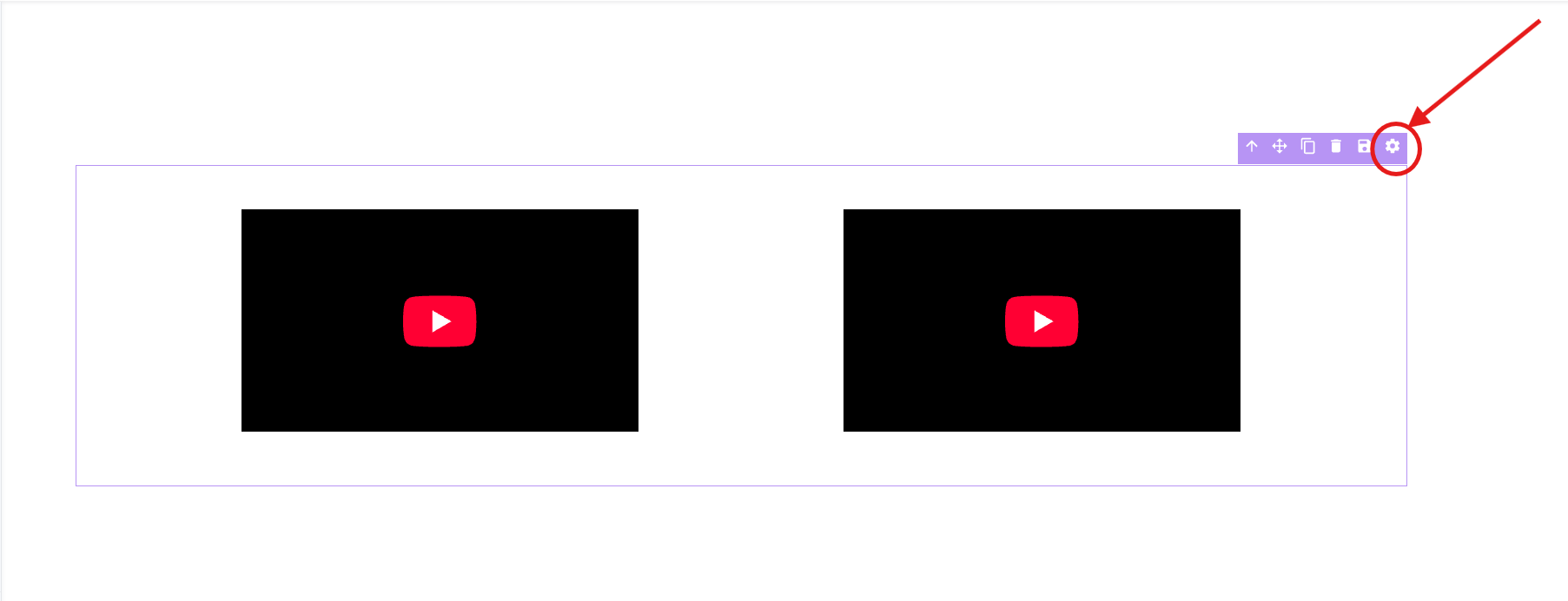
Open the page in the editor and select the section you want to customize. Then click Section Settings to access section-level display controls.
Step 2: Open Background Settings
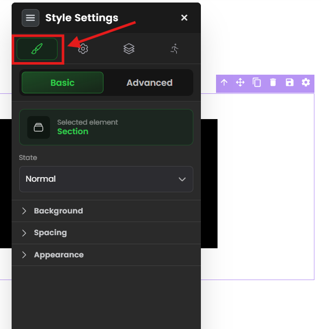
In the Section Settings panel, select Background. This area includes the device-visibility setting for the selected section.
Step 3: Locate the Show On Setting
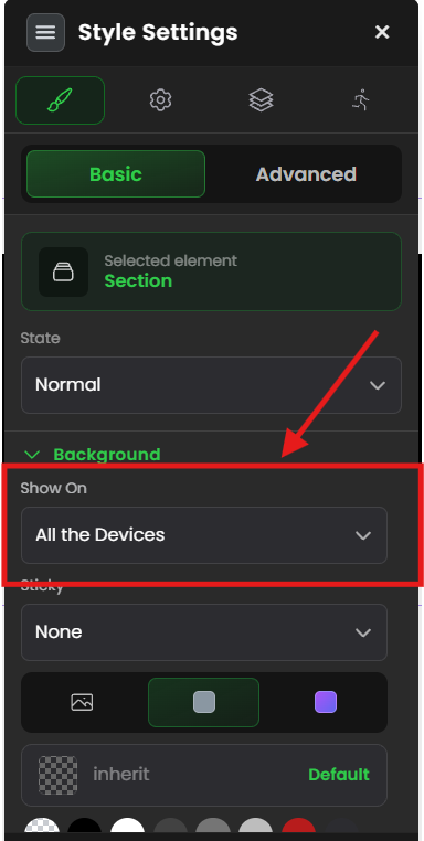
In the Background settings, locate the Show On option. This setting determines which devices can display the selected section.
Step 4: Select Device Visibility
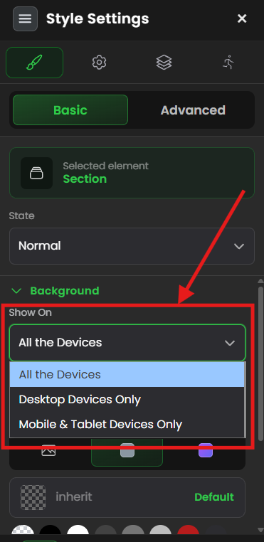
Choose the visibility setting that matches your layout requirements:
- All Devices: The default setting. The section appears on desktop and mobile devices.
- Desktop Devices Only: The section appears only when visitors view the page on a desktop device.
- Mobile Devices Only: The section appears only when visitors view the page on a mobile device.
Save or publish the page after selecting the required option.
Verify the Configuration
Preview or open the published page on the device type selected in the Show On setting. Confirm that the section appears on the intended device and is hidden on devices where it should not be displayed.
Common Scenarios
- Mobile-first design: Display a simplified section for mobile visitors while hiding a detailed desktop section.
- Desktop-specific content: Show large layouts, detailed comparisons, or complex visuals only on desktop devices.
- Device-specific calls to action: Display different call-to-action sections based on the visitor's device.
- Responsive optimization: Hide sections that do not fit well on smaller screens.
Best Practices
- Keep essential information visible on all devices whenever possible.
- Use mobile-only sections to simplify long or complex layouts.
- Use desktop-only sections only when the content cannot be presented effectively on mobile.
- Test every visibility change on actual desktop and mobile devices.
- Avoid hiding important purchase, contact, or navigation options on any device.
- Review the complete page after adding device-specific sections.
Before Contacting Support
- Confirm that you selected the correct section.
- Verify the selected Show On option.
- Save or publish the page after changing the setting.
- Refresh the published page.
- Test the page on both desktop and mobile devices.
Expected Outcome
The selected section appears only on the device types chosen in the Show On setting. This allows you to provide optimized layouts and content for desktop and mobile visitors.
Related Articles
- Using Section Settings in the FlexiFunnels Editor
- Creating Mobile-Friendly Pages in FlexiFunnels
- Publishing a FlexiFunnels Website
Was this article helpful?
That’s Great!
Thank you for your feedback
Sorry! We couldn't be helpful
Thank you for your feedback
Feedback sent
We appreciate your effort and will try to fix the article