Flexi Membership includes a built-in community feed where members can post updates, share ideas, ask questions, and interact with others in the group. The post creation experience has recently been revamped with a cleaner interface and new features — including backdrop colour options and media attachments.
This article walks you through everything: opening the post editor, writing your message, choosing a category, setting a backdrop colour, and publishing your post.
1. Opening the Post Creation Window
To create a new post, navigate to the Community section of your Flexi Membership site, then click into the Feed of the group you want to post in.
You'll see a text bar that says "Write something…" — clicking on it opens the Create post window.
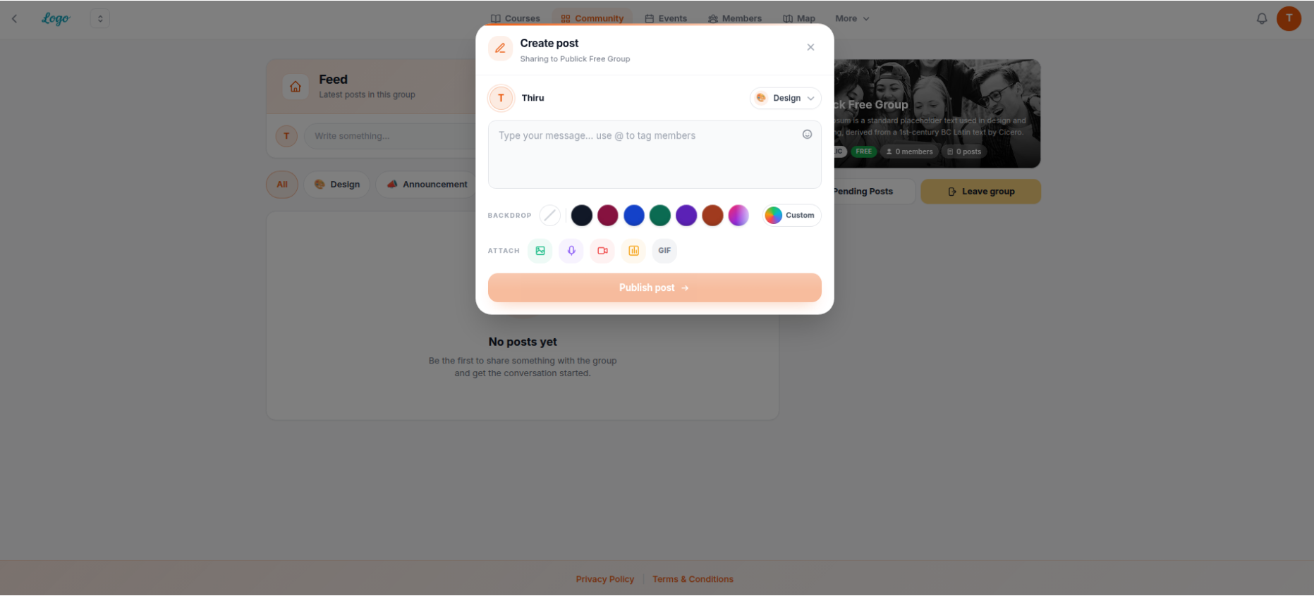
The revamped post creation interface — showing the message area, BACKDROP colour options, ATTACH icons, and the Publish post button
• Your profile avatar and display name at the top left
• A category dropdown at the top right (labelled with the current category, e.g. "Design")
• A large message field with the placeholder "Type your message… use @ to tag members"
• A BACKDROP row for background colour
• An ATTACH row for attachments
• A Publish post → button at the bottom
2. Understanding the Post Creation Interface
Here's what each part of the Create post window does:
| UI Element | What it does | How to use it |
|---|---|---|
| Profile avatar + name | Shows who is posting | Read-only — displays your account name automatically |
| Category dropdown (top right) | Tags the post with a category so other members can filter by topic | Click to open the dropdown and choose a category — or select No category |
| Message field | The main body of your post | Click anywhere in the field and start typing. Use @ followed by a name to tag a member |
| Emoji icon (top-right corner of the message field) | Insert an emoji into your message | Click the smiley-face icon to open the emoji picker |
| BACKDROP row | Sets a coloured or gradient background for your post | Click a colour dot to apply it, or click Custom for advanced options (see Section 5) |
| ATTACH row (5 icons) | Lets you attach extra content to the post | Click the relevant icon: image, audio, video, file/poll, or GIF |
| Publish post → | Publishes the post to the group feed | Click when you're happy with your post |
3. Writing Your Message
@ followed by their name. A list of matching members will appear for you to select from.4. Category Selection
At the top right of the Create post window, you'll see a category dropdown (it shows the currently selected category, for example "Design"). Clicking it opens the dropdown menu.
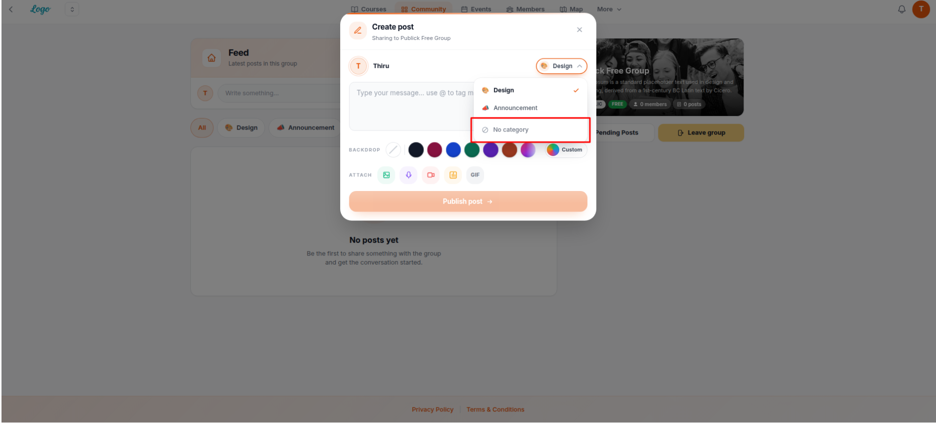
The category dropdown — showing "Design" (currently selected), "Announcement", and "No category" as options
In this example, the dropdown shows three options:
- Design — currently selected (shown with a checkmark ✓)
- Announcement
- No category — select this if you don't want to assign a category to the post
5. Adding and Customising the Backdrop Colour
Using the Preset Colours
Below the message field, you'll find the BACKDROP row. It contains a row of coloured dots — clicking any dot instantly applies that colour as the background of your post.
The first option (a pencil/slash icon) clears any backdrop and returns the post to no background. The last option is labelled Custom, which opens advanced controls.
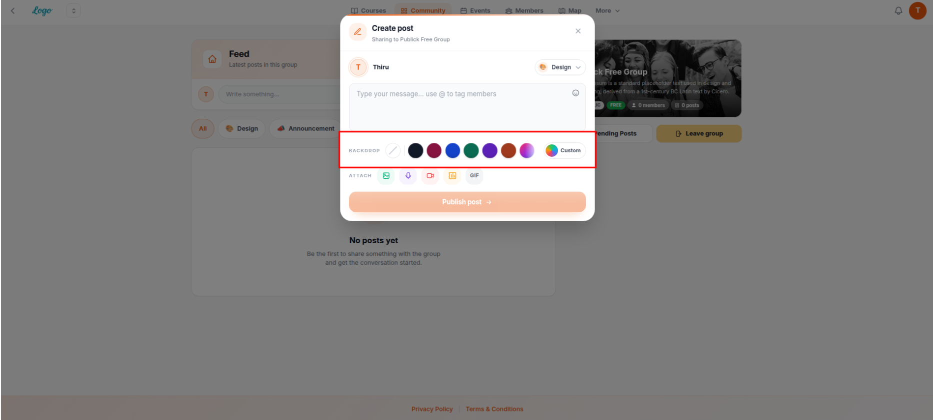
The BACKDROP row — click any colour dot to apply it, or click Custom for more options
Advanced Customisation (Custom Option)
Clicking Custom expands the post editor into a full visual backdrop designer. The message field transforms into a live preview showing your text on the chosen backdrop.
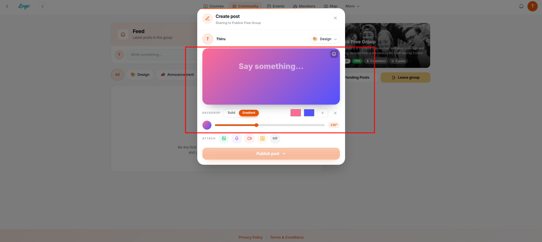
The advanced BACKDROP customisation view — showing Solid/Gradient toggle, colour pickers, an angle slider, and a live preview of the backdrop behind your message
The advanced backdrop controls include:
- Solid / Gradient toggle — switch between a plain single colour (Solid) or a smooth colour blend (Gradient). In the screenshot, Gradient is active.
- Colour pickers (the coloured squares) — click each square to change one of the gradient colours. You can have multiple stops in a gradient.
- + button — adds another colour stop to the gradient.
- × button — removes the last colour stop.
- Angle slider — drag the slider to rotate the direction of the gradient. The value shown (e.g. 135°) indicates the current angle.
- Live preview — the message area at the top of the editor updates in real time so you can see exactly what the post will look like.
6. Attaching Media to Your Post
Below the BACKDROP row, the ATTACH row lets you add extra content to your post. Five icons are available:
| Icon | What it attaches |
|---|---|
| Image icon (envelope/photo) | Attach an image file |
| Microphone icon | Attach an audio file or recording |
| Video/camera icon | Attach a video file |
| Table/grid icon | Attach a file or create a poll |
| GIF text button | Insert an animated GIF |
7. Publishing the Post
When you're happy with your message, category, backdrop, and any attachments, click the Publish post → button at the bottom of the Create post window.
8. The Published Post — What It Looks Like
Once published, your post appears in the group Feed for all members to see.
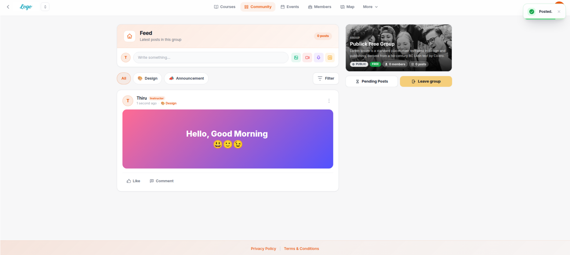
A published post in the Feed — showing the author name, role badge, timestamp, category tag, backdrop, message text, and the Like and Comment actions
Each published post card displays:
- Author avatar and name — along with their role badge (e.g. Instructor) if applicable
- Timestamp — shows how long ago the post was made (e.g. "1 second ago")
- Category tag — the category the post was filed under (e.g. Design)
- Post content — your message displayed on the chosen backdrop. If you selected a gradient backdrop, it appears exactly as previewed
- Three-dot menu (top-right of the post card) — for post management options
- Like button — members can like the post
- Comment button — members can leave a comment on the post
9. Comments — Mobile Interface
When a member opens the Comment section on a mobile device, it appears as a bottom sheet panel that slides up from the bottom of the screen.
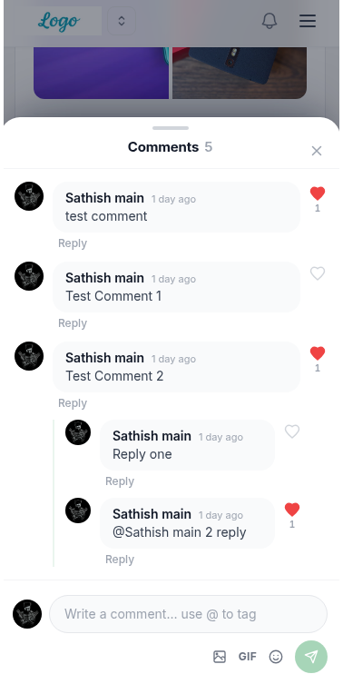
The mobile comments panel — a bottom sheet with the comment count, all comments and threaded replies, a heart icon for liking individual comments, and a comment input bar at the bottom
The mobile comment panel includes:
- Comments [count] heading — shows the total number of comments (e.g. "Comments 5") and an × to close the panel
- Comment list — each comment shows the author's avatar, name, timestamp, and their message
- Heart icon — tap to like an individual comment; the heart turns red and a count appears when liked
- Reply link — tap Reply under any comment to respond to it directly (replies are shown indented underneath the parent comment)
- Threaded replies — replies appear nested under the original comment, showing the
@mentionof the person being replied to - Comment input bar (bottom of the panel) — with placeholder text "Write a comment… use @ to tag", plus icon buttons for attaching an image, inserting a GIF, adding an emoji, and a green send button
@ followed by a member's name in the comment box to tag them — this works the same way as tagging in the main post message field.Common Questions
@ followed by their name. A list of matching members will appear — click on the name you want to tag.Was this article helpful?
That’s Great!
Thank you for your feedback
Sorry! We couldn't be helpful
Thank you for your feedback
Feedback sent
We appreciate your effort and will try to fix the article